
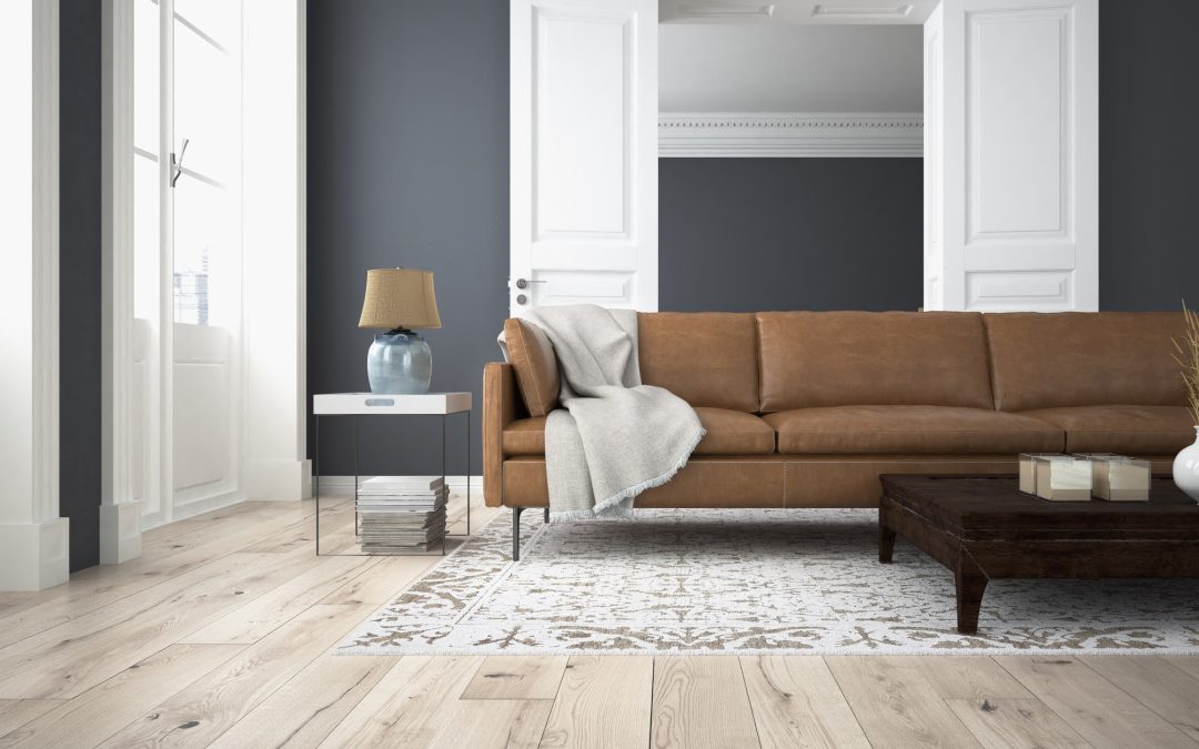
Color does more than make a room look attractive. It can change how a space feels and even how you use it throughout the day. A soft palette can make a bedroom feel calm, while richer shades can give a living room more energy and personality.
The right colors also help create a sense of balance. When walls, furniture, bedding, and accents work together, a room can feel intentional without looking overly designed. This article will explore how different palettes affect a space and how it can make it easier to create rooms that feel right for you.
Create Calm With Soft Bedroom Colors
Bedrooms benefit from colors that encourage relaxation. Soft blues, muted greens, warm grays, and gentle beige shades can create a peaceful backdrop. These colors tend to feel quiet without making the room look plain. The intensity of a color matters as much as the color itself. A deep blue may feel dramatic, while a pale blue can feel airy and restful. If you want your bedroom to feel more soothing, consider softer versions of your favorite colors rather than highly saturated shades.
Your bedding and larger furnishings can reinforce this feeling. Neutral sheets and understated accents can keep the palette cohesive. The goal is not to eliminate color but to use it in a way that supports rest.
Add Warmth With Inviting Living Room Colors
Living rooms often serve many purposes. They may be used for conversations, reading, relaxing, entertaining, or watching television. Warm neutrals, earthy greens, muted terracotta, and soft browns can make these spaces feel welcoming.
Warm colors can also make a large room feel more intimate. Shades such as taupe and warm gray provide flexibility without creating a cold atmosphere. You can then introduce stronger colors through pillows, artwork, rugs, or other smaller features. Layering is especially useful in a living room; instead of choosing one color for everything, build a palette around a dominant shade and add complementary tones. This creates visual interest while keeping the room comfortable and easy to live in.
Energize Kitchens With Fresh Color Combinations
Kitchens often benefit from colors that feel clean and lively. Whites, pale greens, soft yellows, and light blues can create an open atmosphere. These shades can also work well with natural materials such as wood and stone.
Brighter colors can be effective when used selectively. For example, a colorful backsplash or set of accent chairs can add personality to a design without overwhelming the feel of the whole room. Doing this gives you the freedom to experiment while keeping the larger design balanced.
Consider how natural light changes the palette during the day. A color that looks crisp in morning sunlight may appear warmer under evening lighting, so make sure to test paint samples in different parts of the kitchen to see how the colors actually behave.
Use Focused Colors to Shape Home Offices
A home office should support concentration without feeling sterile. Blue and green tones are often useful for creating a composed environment, while warm neutrals can make the space feel more comfortable. Color can also help visually define different areas. If your office shares space with another room, a distinct wall color can create a subtle boundary.
Avoid choosing a color solely because it looks appealing in a photograph. Your office lighting and furniture all affect how the color feels. A balanced palette can provide visual interest without becoming distracting during long periods of work.
Balance Energy and Comfort in Dining Spaces
Dining rooms can handle more expressive colors than bedrooms. Deep green, navy, warm rust, muted red, and rich neutral shades can create a more social atmosphere. These colors can make meals feel like an occasion without making the room feel formal.
If a bold wall color feels too strong, use the shade in smaller elements instead. Dining chairs, artwork, curtains, or table accessories can introduce the same mood with less commitment, while also making it easier to change the room seasonally. Lighting plays an important role here, too. Warm bulbs can deepen earthy shades and make neutral colors feel richer.
Keep Color Choices Connected Throughout the Home
Each room can have its own personality, but the colors should still feel connected. Repeating a few shades across different spaces creates continuity.
This does not mean every room needs to use the same palette; instead, choose a broader color story for the home. For example, warm neutrals might appear throughout the house, while blue or green accents change from room to room. This creates variety while preventing the overall design from feeling disconnected. The same principle applies to furnishings and accessories. If you’re updating a bedroom, consider how the colors work with your existing furniture rather than starting with paint alone.
Let Light Guide Your Final Color Decisions
Natural and artificial light can dramatically change the appearance of a color. North-facing rooms often receive cooler, less direct light, while south-facing rooms tend to receive warmer and stronger light. The same paint can therefore look different from one room to another.
Artificial lighting adds another layer. Warm bulbs can bring out yellow and red undertones, while cooler bulbs may make blues and greens appear more pronounced. Testing colors under the lighting you actually use is one of the simplest ways to avoid an unwanted result. Give yourself time to see how the color changes from morning through evening, since a palette that remains appealing in different lighting conditions is more likely to feel comfortable over time.
Final Thoughts
Color is one of the simplest ways to influence the feeling of a room. By choosing shades based on the purpose of each space, you can build a home that feels both comfortable and personal.
You might tackle your upcoming home refresh on your own, or you may prefer to enlist professional interior design services. Either way, starting with the core mood you want to create allows your color palette to guide the rest of the design effortlessly.
Ready to find the perfect palette for your space? Contact our design team today to help you bring your vision to life!
Frequently Asked Questions
What colors are best for creating a relaxing bedroom?
Soft blues, muted greens, gentle grays, and warm neutrals are popular choices for restful bedrooms. Less saturated versions of these colors can create a quieter atmosphere without making the room feel dull.
Can dark colors work in small rooms?
Yes. Dark colors can add depth and make a small room feel cozy and intentional. The effect depends on lighting and how much of the room is covered in the darker shade.
How many colors should be used in one room?
There is no strict rule, but using a main color with one or two supporting shades can create a balanced look.
Should every room in a house have the same color palette?
Not necessarily. Different rooms can have different moods. Repeating a few finishes or accent shades throughout the home can help the spaces feel connected.
How can I test a color before painting?
Use sample areas or large paint swatches and observe them at different times of day. Check them alongside your flooring, furniture, fabrics, and lighting to see how the complete combination looks.
