Summer holidays can lead to poor homecoming decor choices. You may be tempted to duplicate the vibe of your resort’s coolest bar, with its stripped-down interior. Yet the mix of white walls and artfully beaten-up chairs that promised to bring sunshine into your home on November days may prove a disappointment. Under grey skies the aesthetic may remind you less of lazy days on the beach than the inside of a disused sanatorium.
Eileen Gould Design & Construction can transform your home or business into a space that inspires!
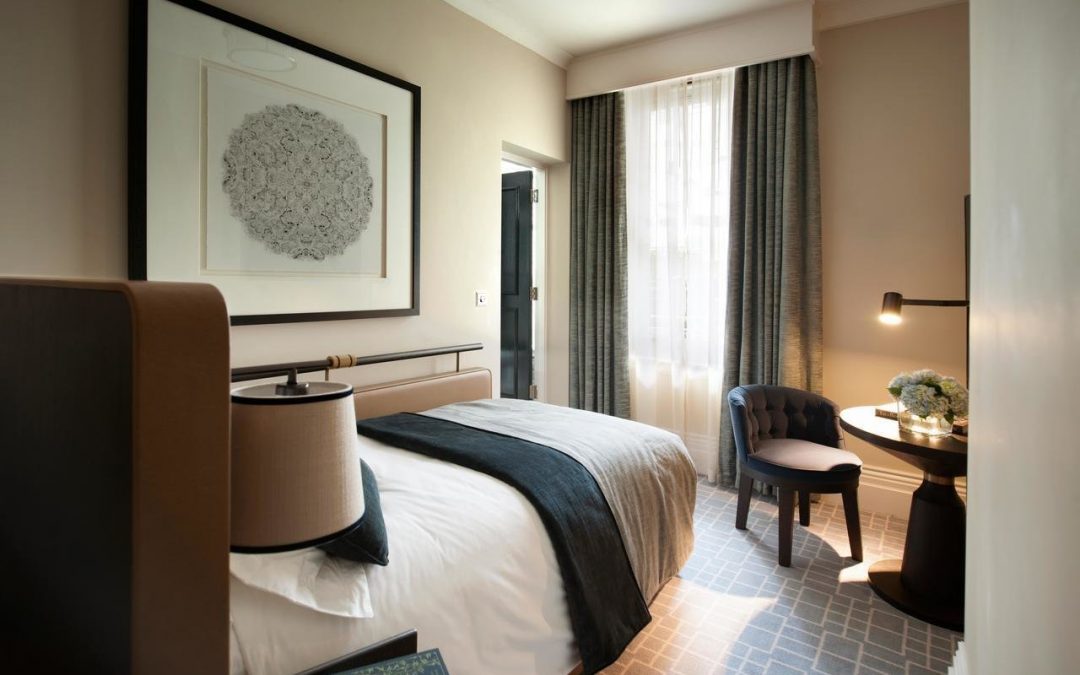
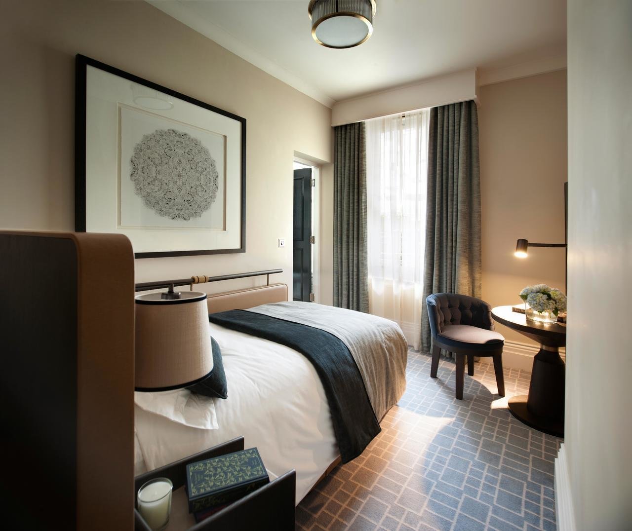
Crittall doors and a navy and beige palette lend modernity and warmth to London’s Principal
It may be more useful to draw your inspiration from a hotel or restaurant that you have visited on these shores, where hours of sun are not guaranteed. Some of the most successful domestic luxury interior trends of today, such as navy or near-black paint, millennial pink and parquet, began in hospitality industry establishments. Acknowledging this influence, the bedrooms and other spaces of hotels are now designed to be a home-from-home that you aspire to recreate in your own home: elegant, comfortable and just quirky enough.

The description “residential feel” is being used to sum up the rooms at the Principal, a five-star hotel in Bloomsbury, London, formerly called the Russell. In its earlier state, the hotel embodied the words “faded grandeur” and “down on its luck” as a result of its use for the more workaday kind of business meeting. Its lavish late-Victorian architectural and decorative features were either boarded up, or covered in muddy red paint. After its acquisition by Starwood Capital Group, a US business, the Principal was renovated and refurbished by Tara Bernerd, boss of the Tara Bernerd design group. Now owned by Covivio, a French company, the hotel reopened this summer aiming to be a hip place to stay and a style statement.
Bernerd outlines her objectives: “I want the Principal to be a place where guests and locals never want to leave; where the energy embraces you and you feel welcome and at home. Given its history, the hotel merges notions of the old Bloomsbury set with the new revival of the area; a homage to the past with authentic materials, fabrics, dark wood-panelled walls and stone floors, but combined with a modern aesthetic: striking bronze Crittall doors, statement lighting and mosaic floors.”
It is true that, at first sight, the hotel, a grade II listed edifice overlooking Russell Square, may not appear to be the most obvious source of ideas for a house in the suburbs. Its ornate Renaissance revival terracotta façade was devised to ensure that the hotel became a landmark in this part of London, known for its academic and literary associations.
The sensation of awe continues when you step inside the marble-lined lobby. The mosaic floor designs mimic those on which the hotel’s first guests walked and wondered at the sight of all that finery. Some of the original mosaics have been restored, such as a winking sun surrounded by the signs of the zodiac, a moment of humour among the temple-like architecture. The traces of glitter in the flooring provide a frivolous touch that sets you thinking what other elements of the interior you could borrow for the benefit of your home.

Classic-style friezes, a nod to the nearby British Museum, adorn the hallways in the lobby and the walls of the ballroom whose walls are painted pinky beige. This shade is likely to be liberally copied by guests on their return home. A few may also be scouring the upmarket homeware stores of Tottenham Court Road (a ten-minute walk away) for cushions similar to the ikat-pattern cushions in the Principal’s Palm Court. The stone-meets-pink paint used in this space would suit most sitting rooms: it is Dulux’s 50YY 47/053.
Elsewhere there are features that offer lessons in how to refresh the look of your home. A cluster of crystal chandeliers, some of which hung in the hotel in the 1930s, lend glamour and sparkle, while spotlights and table lamps add warmth. A new marble fireplace has been installed in one of the antechambers that lead off the lobby.
The palette of the bedrooms is grey, navy and beige, offset with vases in metallic shades. The simplicity is bordering on the austere, yet such is the calming effect that some guests will fall asleep immediately. Others will stay awake, studying the storage solutions. Some of the wardrobes have curtains rather than doors, which Bernerd sees as a “great way of maximising space while also adding another visual layer in terms of warmth and texture”.
In the bathrooms Bernerd opted for Crittall frames, which give a “more contemporary design DNA”. The Crittall business was founded at the end of the 19th century, at about the same time that the Principal opened its doors. Both are staging a triumphant return.
For the original article click here: https://www.mansionglobal.com/articles/how-to-copy-hotel-interior-design-trends-at-home-105505